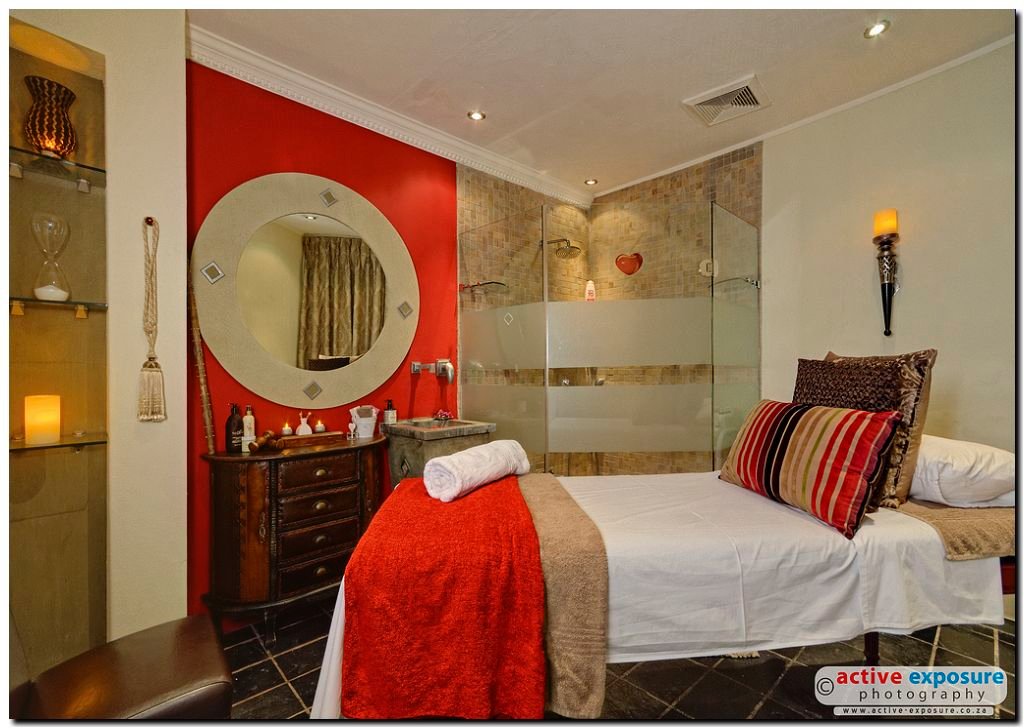
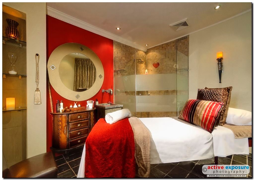
Before and After
Mar 23, 2013 | By: Herman Bosman
When it comes to photographing interior and exterior spaces, it is critical to capture the true essence and "feel" of the environment in your images. Doing this is no easy task, which is why architectural and interior photography is regarded by many as one of the most difficult and challenging genres of photography.
What separates the average results from the spectacular results is directly related to lighting, both natural and supplemental. When my clients require only the best, we take the path less travelled and fully light each room. We do not just take images, we create them.
Using the example below from a shoot we did yesterday, the BEFORE image is a manually blended composite image using three exposures (underexposed, normal exposure & overexposed) and using mainly the available light with a very low dosage of fill light. No further editing was done on this BEFORE image. The AFTER image is the same blended exposure, but with accent lighting applied to specific areas to draw the viewer in, highlighting textures and to add dimension to the photograph. The accents have a subtle yet powerful effect of making the scene look more moody, more romantic and overall more inviting. Compare the cushions, cabinet and end of the bed to the before image to see the subtle differences.
We have full control over how we want the images to look, and will consistently produce images taylored to your own unique requirments.
So, what are your thoughts on this before & after example?
Before:

After:


0 Comments